When was the first time you used PowerPoint?
The transition from poster board and Elmer’s glue to digital presentations is blurry for me. I couldn’t tell you exactly when I first used the program for a school assignment. What I do remember is that I was never taught how to use PowerPoint. Millennials are members of a tech-savvy generation. If we buy a new gadget, such as a tablet, we don’t need to read the user’s manual to understand how to work the technology. We just know. The same applies to initially learning how to use PowerPoint – We didn’t need training to get a hang of the program. However, as a result of this lack of training, I’ve noticed that many students clutter their slides with images, charts, hard-to-read fonts, and harsh colors. Everything they plan to say is written out word-for-word on the slides. The PowerPoint presentation becomes a distracting crutch. Here are 4 tips for creating simple but effective visual aids!
![]()
Don’t let technology outshine you
If you’re delivering a presentation, and everything you plan to say is written out on your digital slides word-for-word, what is the point of you being there in the first place?! Don’t let PowerPoint outshine you as a speaker. Your audience should absorb most of your information aurally, not visually.
Think large & legible
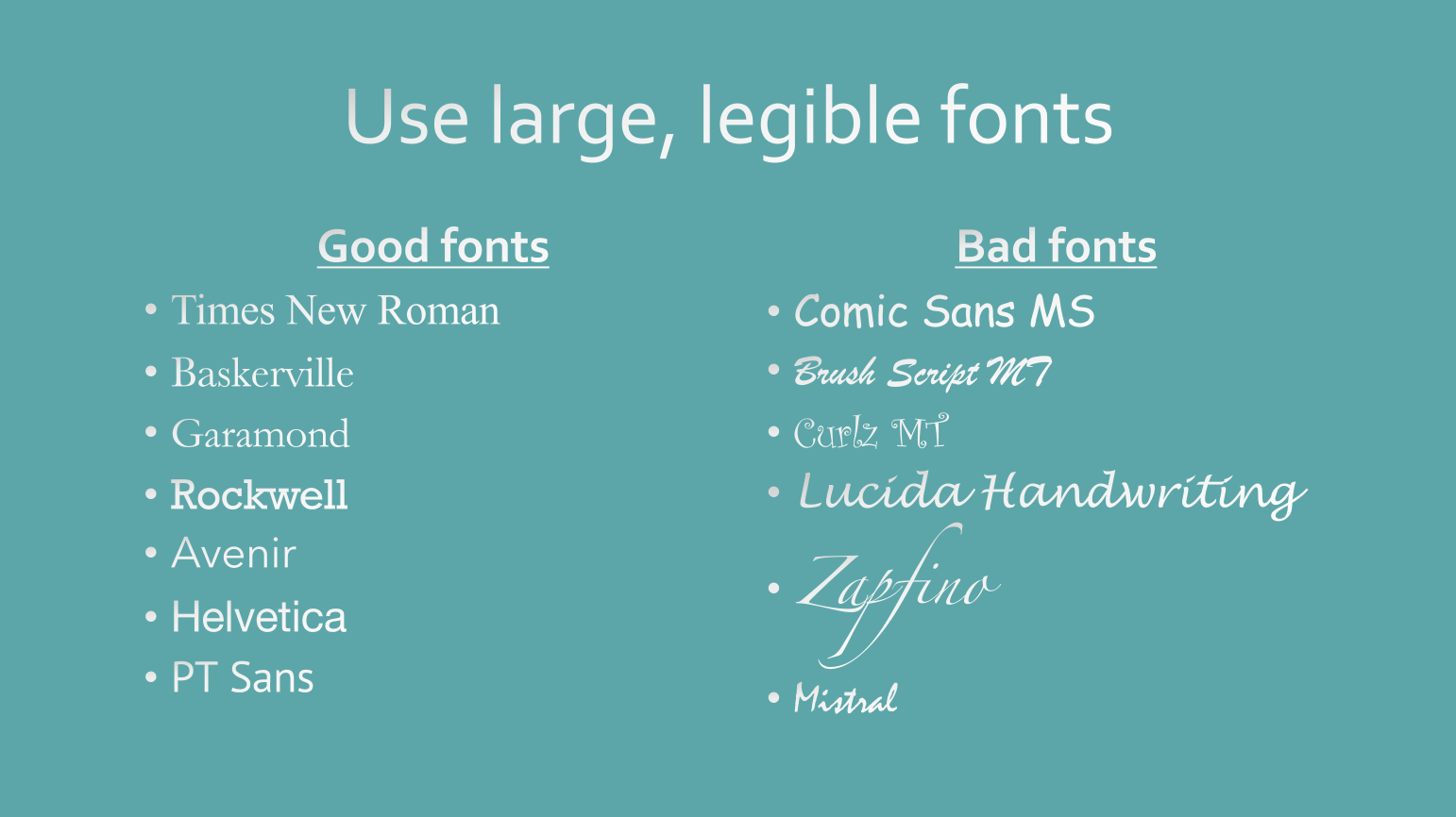
When you’re using your tablet, laptop, or desktop to create a PowerPoint presentation, size 12 font doesn’t look that small. You’re so close to screen – it’s easy to read. But once that PowerPoint is projected onto a large screen, that size 12 font looks miniscule. If you’re delivering a presentation in a large room, such as a lecture hall, viewers in the back of the space will definitely have trouble reading your slideshow. Avoid using font smaller than 20pt in the body. Similarly, avoid artistic, calligraphy style fonts. Stick with consistent, easy-to-read fonts like Times New Roman, Roboto or Helvetica.
Keep bullets brief

Any words on your PowerPoint should summarize your main speaking points. Even the best listeners get distracted. Provide your audience with succinct bullet points that will pull them back into your speech. It will be more challenging for your audience to listen to you and try to read a cluttered slide.
Hi-res or bust


If a photo doesn’t look crisp on Google as a thumbnail, there’s no way it’s going to be clear stretched out on a large monitor or Smart Board. Only display high resolution images on your slides.